Forum Replies Created
-
AuthorPosts
-
Its Spyro! I love it!
LMAO!!!!! Oh lordy, it is! So did not make that connection. :bigsmile:
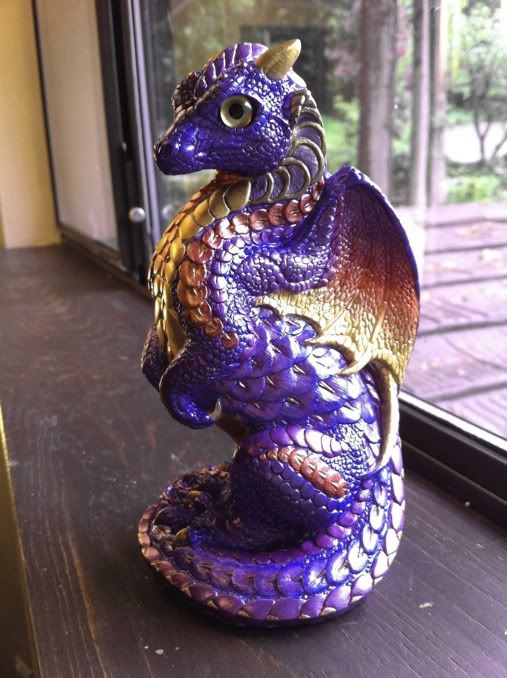
This one’s being done for a girl’s birthday. Her mom had her point out a couple of color schemes in a book of dragon drawings; I kind of combined the two a bit.
*can’t stop snickering*
Here’s another pic–actually dragged out a “real” camera and shot in RAW for this one, trying to get closer to the real colors. This one shows more of his chest, and also has the periwinkle (non metallic) eyes in place. Of course, his wings now look more washed out and he’s lost the overall purple. Call him a cross between the two, I suppose. LOL Better pics will be posted when the weather cooperates…
Maybe black antiquing everywhere EXCEPT the wing scales, and do those with ____? (suggestions?)
The latest–his nickname is Plague…because he’s been one (and he looked like he was suffering from one in the beginning!) His “kennel name” is Jolie’s Tequila Sunrise, partly for the color, partly because he seriously comes close to driving me to drink. 😀
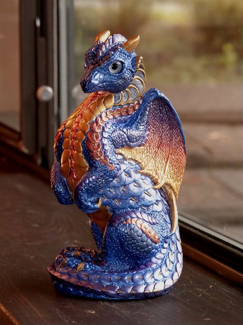
Opinions needed for antiquing: what color? I’m inclined to do a warm toned black, to darken him a little overall & pull out the texture, but I’m worried about how that would look over the wings. Blues & purples do NOT photograph well with iPhones; even with editing, this is as close as I can get with current weather restrictions limiting outdoor photography. On my screen, he shows as more purple in this pic–and in some lights, he is–but he’s also very blue, if that makes sense. The blue you see here between the larger tail scales is probably a brighter blue than his true base color, but not by much.
Eyes in this pic are Tohickon metallic gold; they may or may not end up that way (it’s a little brighter gold than it looks here). I’m having a heck of a time choosing between Tohickon’s gold, silver, silver-blue, and Windstone’s Periwinkle. The metallics all seem too bright when viewed in regular room light (away from the window)–it’s all your eye is drawn towards. The periwinkle blends in so well, it’s almost too bland. I’m hoping that will sort itself once he’s antiqued.
So–antiquing thoughts? Other than a few touchups, he’s about ready for that step, and opinions would be very welcome. I’m really worried about screwing up those wings.
June 2, 2012 at 6:45 pm in reply to: Autumnglory's First PYO – Savanna, the Winged Wolf, Now With Image! #881290Great job! And wolf eyes are WAY harder than any other PYO I’ve done. Even with special tools to assist, mine still didn’t come out perfectly set either. If you find any wolf-specific tips, let me know!
Great work, Siri! As always, I envy your blending skills. 🙂
Big congrats! I think you’ll look back and know it was worth it. Right now, it’s just a relief to be done. 😀
Good luck on the internship–fingers crossed for you!
Less patina and more purple with teal eyes! 🙂
Ditto. I like almost no patina. I like the coppery color with lots of violet.
This for me as well, though I’d add in that the airbrushed gold highlights that were added with a very light touch to accent the musculature on both my male (not from the current batch) and my lap really help to make the pieces shine.
I understand the patina idea is to make them look like actual weathered copper–but because of the lifelike qualities of the sculpts, it just doesn’t work for me that way. I can buy into the ivory scheme looking like a carving, or if you used the stone-like paint used on the gargoyles. For some reason, though, even the heavily patinated coppers don’t look like cast copper Windstones that have been out in the rain, they just look mildewed and dusty to me. I notice this especially on my male’s tail on the non display side, where the patina is heavier–I see it from across the room and it always looks dirty, even when freshly dusted.
That’s why it was so critical for me to get a lap from the last batch; the balance of colors felt “right” to me. With all the differences between batches, I was concerned that I might never get one with that blend at all from a future batch. Seeing the latest sculpts painted in this scheme, I’m glad I made the decision I did, because for the most part, they don’t do a thing for me. I do like the heavier antiquing though on some of the pieces we’ve seen.
Don’t get me wrong–I have plenty of weathered copper in my yard, so it’s not that I’m not a fan of the stuff in general. I just prefer a more newly minted copper look to these guys. In fact, I’d love a copper scheme (or a bronze scheme) with no patina at all.
I hope a forum member won that Ornate Hawk Griffin so we can see what eyes they picked!!! That was a stunning piece, I really expected it to sell for more. If you won him, post pics! Pretty please with puppy dog eyes? 🙂
I’m hoping we get to see “at home” pics of all the current ebay griffs. They’re amazing!
I’d also say both–with the caveat of “whatever we can have soonest!” LOL If gold plating is going to take three months, but paintable we can have next week (etc…not holding you to times), then I’d go paintable.
Or if they’re the same horns as used for the youngs…I’d say plate ’em and let’s have another Young GB in the same Safari theme as the recent GB babies. 😀 (With copious apologies to Melody, who by now is probably sick to death of painting stripes and spots!)
May 23, 2012 at 7:54 pm in reply to: Finally Painting Again ^_^ (updates bottom of page 1) Almost Done with Bull Raptor #880829LOVE how he’s coming out! And I’m extremely jealous; I love the straight, clean, well spaced stripes that I never in a million years could master. 🙂
I did get my order, almost two weeks after. They responded to my email a few days after I posted here. They had to make the eyes, and they took half of the shipping price off for the extreme delay. So I can’t complain and will order again sometime =) the eyes really are very pretty
A current heads up on Tohickon: I ordered eyes in a number of colors and sizes from them two days ago; received a notice this morning that they were shipping out today. So depending on what you’re looking for, they *may* be back to reasonable turnaround times.
After a ton of hemming and hawing and asking people’s opinions, I decided to change my baby uni’s eye color to blue, and his gem to blue.
This is how he looks now, outside, with metallic blue glass eyes 🙂
Ooooh…..love the change! It always fascinates me how different they look with such small changes.
Wow. I got the reference wrong. It is drop water on him, not feed after midnight. Water makes “babies” and feeding after midnight makes the babies ugly and mean. lol
Nope – I still don’t recognize the reference. 🙂 What is it?
LOL–it’s from the movie “Gremlins”.
And Robin, I get that one backwards too!
Well,my two are gone to new homes and you are most welcome.It would have been nice to have gotten my little white one but looks like it was not ment to be.Too bad,I would have given a lot for it.Thank you for the golden one Brandy.You are a sweetheart of a person and very kind.
Bodine–TELL me you didn’t get rid of that cuttlefish beauty???? And don’t give up on getting what you want. Maybe it doesn’t happen right now–but it happens a week or a month or even a year out. Part of the reason my copper lap sits on my desk within hand’s reach is to remind me of that–not just in Windstones, but in life.
—-
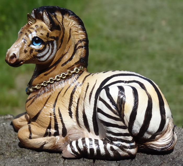
To anyone who’s better at picking out the individuals from the group shot, because I get dizzy just looking at it, LOL: How many of the just white with black stripe variations were there altogether? (I’m lumping the tigers and zebras together at this point, since facial & leg patterns from one seem to show up with body patterns from the other.)
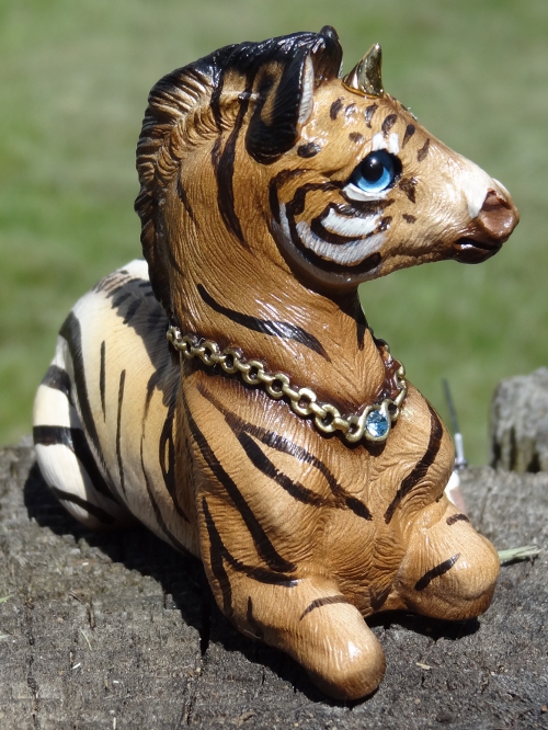
Mine (from a trade) also has the metallic silver eyes (that look almost blue indoors). Chessie did a great job picking eye colors for the black & white ones–I think the only one I’ve seen with traditional “horse-brown” eyes was the one chrisherself posted a page or so back. The lighter/brighter colors stand out so well against that white & black background.
The metallics just seem to have so much more depth to them than the regular colors. The metallic gold on my tigerloosa has to be my favorite eye color yet–not too bright a gold, almost amber, but they look almost alive.
That metallic lilac is amazing! Count me in on those!
I’d love to see a toned down gold from what Tohickon produces. I haven’t yet seen theirs in person (just ordered), but from the pics, I’m pretty sure it’s going to be a brighter gold rather than a tawny one.
Any way to perhaps do a two color–one lighter hue ringing the pupil, one darker spread towards the edges? Might be tough to match the blending from eye to eye, I know…
I started with just one seal point small flap cat, WAY back when they were (ahem) a fairly new sculpt, and then didn’t buy another Windstone until this year. So don’t worry, we all started somewhere…and not all of us have achieved the heights of some of the collections shown here! 😉
You have a great start! That rainbow young is so pretty.
-
AuthorPosts
