Home › Forums › Miscellany › Help & Feedback › New website concerns (fixes, suggestions, etc)
- This topic has 671 replies, 61 voices, and was last updated 3 weeks, 6 days ago by Clay.
-
AuthorPosts
-
March 18, 2020 at 2:41 pm #1606329
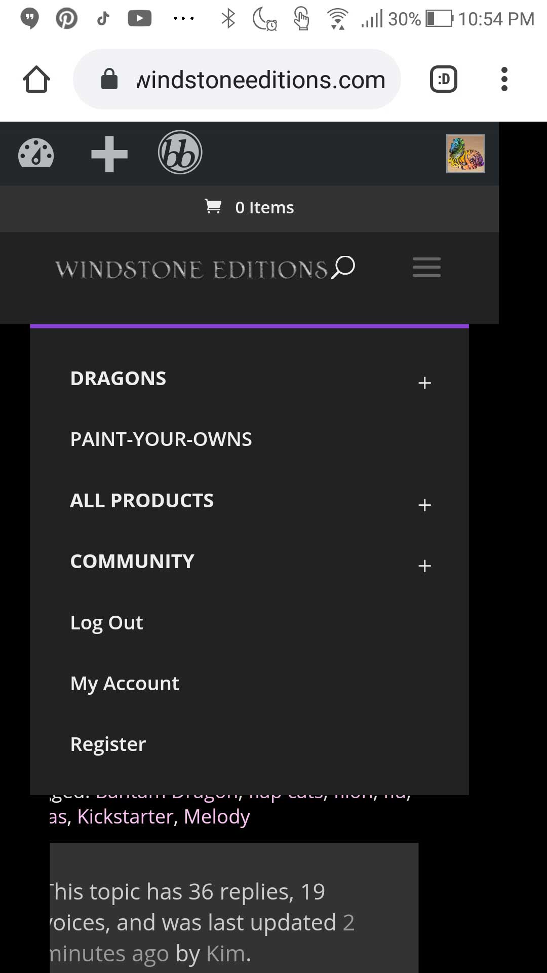
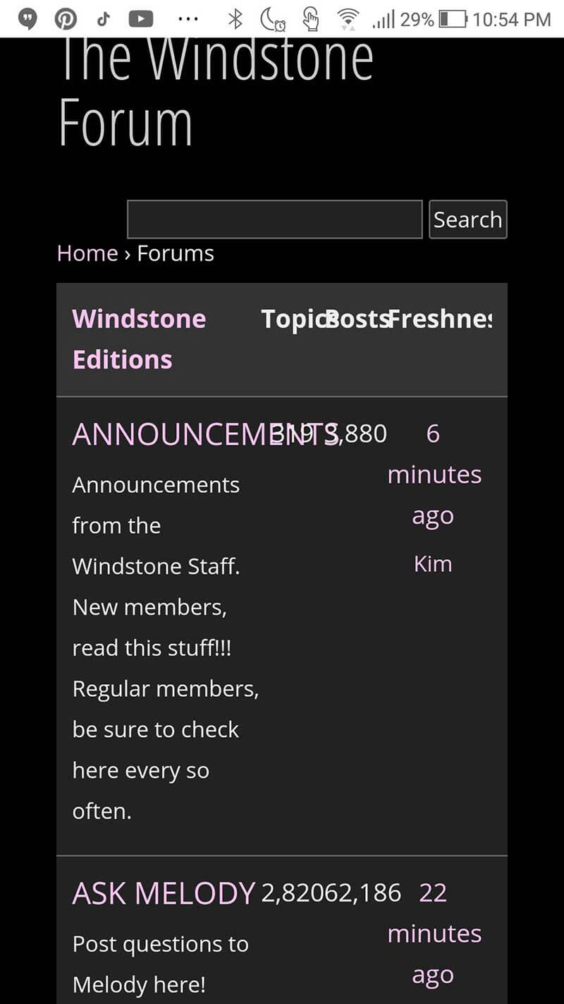
I have adjusted the width of the mobile menu as well as the forum pages, so both of those things should no longer be cropped off. However, the Chrome mobile browser seems to still be loading from cache, even though I have cleared the browser cache. This is probably where the problem has been all along. I know this is the problem because if I open a new “incognito” tab in Chrome, the menu and the forum pages look good, but in a regular tab they are still appearing too wide. Incognito tabs don’t load anything from cache, they just pull everything directly from our web server. If the mobile menu or forum pages appear too wide on your phone, and you’re using Chrome, please try opening an Incognito tab and see if the site looks normal there. I’m currently looking into why this is happening with Chrome. Anyone using Safari or other browsers shouldn’t have a problem.
March 18, 2020 at 2:50 pm #1606330Thanks Clay, it seems to be fixed for me. Hopefully it is for Kim as well.
Looking for:
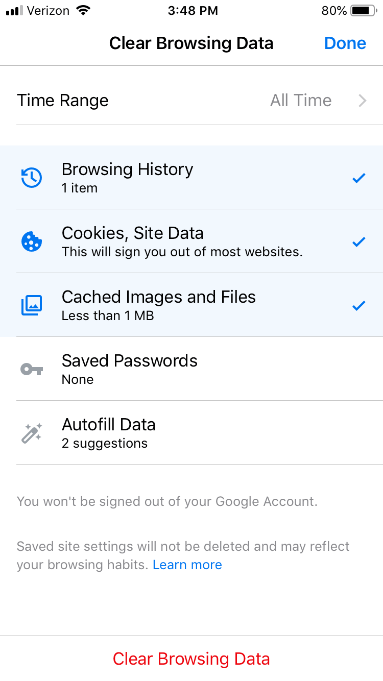
"COSMIC SHIFT DRAGONS and KI-RINS" and the "OCTOPUS TANUKI TEST PAINT #1"March 18, 2020 at 2:52 pm #1606331OK, I found the fix for Chrome (at least it worked for me). When clearing your cache, make sure that “Time Range” (near the top of the screen) is set to “All Time.” The default setting is “Last Hour,” and since you probably have files stored in there from browsing our site more than an hour ago, that’s not going to work.
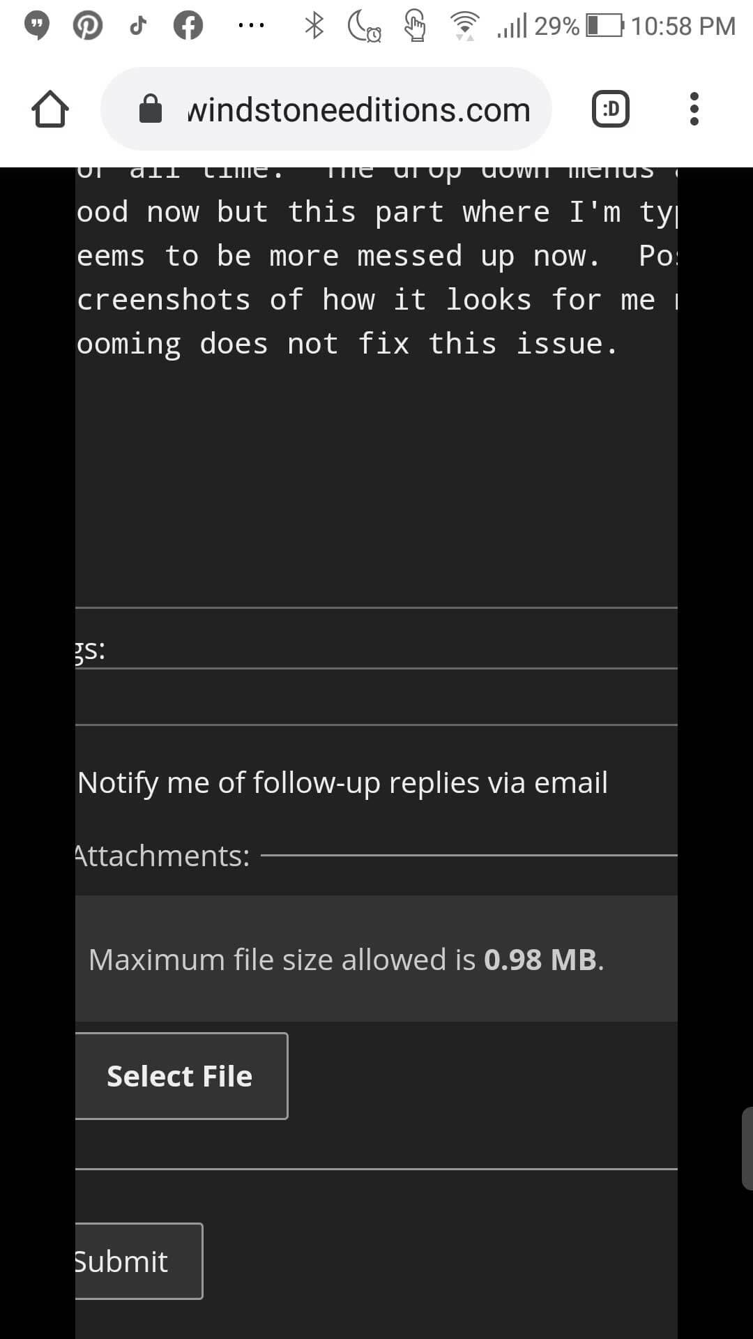
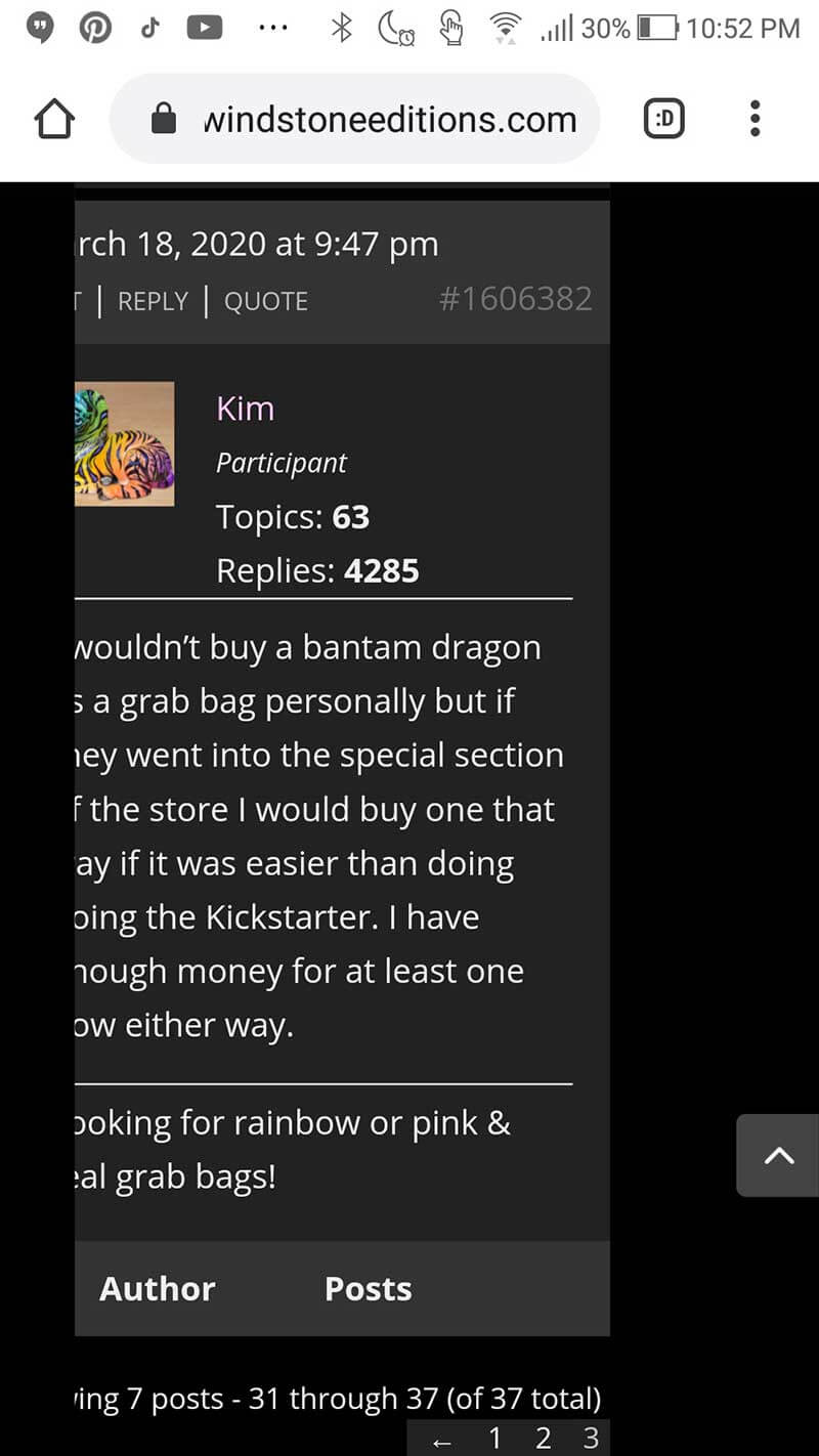
March 18, 2020 at 10:01 pm #1606384Okay Clay I am using Chrome on an Android phone and I cleared everything for all time. The drop down menus are good now but this part where I’m typing seems to be more messed up now. Posting screenshots of how it looks for me now. Zooming does not fix this issue. When I type here it messes up the alignment of everything above too as you can see in the screenshots.
Looking for rainbow or pink & teal grab bags!
March 19, 2020 at 1:03 pm #1606446I’m using a Samsung Galaxy S10 with chrome and a Samsung TabS3 with chrome and the website and typing work normal on both.
You might have to try using a different app like Firefox and see if it helps.March 19, 2020 at 1:32 pm #1606457Since Kim seems to be the only one experiencing these mobile formatting issues, I will be communicating with her about it via PM. That way we don’t bombard all of you who subscribe to this thread with emails about stuff that’s not relevant to you. But if anyone else is having similar issues, please let me know, and I will help you out.
March 19, 2020 at 2:58 pm #1606462In melody’s blog spot when I go through it and go to the next page and click to see an item, when I click back it takes me all the way back to the beginning. Is there a way for it not to do this? I’m on my iphone using safari. Thanks Clay!
March 19, 2020 at 4:16 pm #1606465In melody’s blog spot when I go through it and go to the next page and click to see an item, when I click back it takes me all the way back to the beginning. Is there a way for it not to do this? I’m on my iphone using safari. Thanks Clay!
I just revised the formatting of the blog. You shouldn’t have that issue anymore. You may need to clear your browser cache to see all of the changes. And reload the page from the navigation menu because the URL has changed. It’s https://windstoneeditions.com/blog
March 20, 2020 at 5:04 pm #1606532Clay,
I can’t edit my ad on my desktop (Win 10 / Firefox) or on my phone (iPhone 8 / Safari). I click on edit and the frame comes up, but the ad isn’t in it.My keyboard is broken. I keep pressing "Escape", but I'm still here.
March 20, 2020 at 5:21 pm #1606534Clay,
I can’t edit my ad on my desktop (Win 10 / Firefox) or on my phone (iPhone 8 / Safari). I click on edit and the frame comes up, but the ad isn’t in it.OK, let me take a look at that.
March 20, 2020 at 5:32 pm #1606535Clay,
I can’t edit my ad on my desktop (Win 10 / Firefox) or on my phone (iPhone 8 / Safari). I click on edit and the frame comes up, but the ad isn’t in it.This is happening on your two most recent ads, which both have a ton of image links. I’ll PM you about it.
March 24, 2020 at 6:18 pm #1606847The dropdown menu in the top right corner is only showing part of the store, nothing else. Maybe due to internet bogging down, and not a bug on the website? It’s an unimportant one, you can access the forum and classifieds from the bottom of the home page.
March 24, 2020 at 8:02 pm #1606853I’m not sure which dropdown menu you’re describing. The COMMUNITY menu? Maybe you could post a screenshot?
March 25, 2020 at 6:52 pm #1606896Sorry I’m a technoidiot, I don’t know how to do screenshots. Amongst many many other things. The dropdown menu I meant is the 3 lines next to the Search magnifying glass symbol. But really it’s just as easy to access sites from the list on the bottom of the page.
March 26, 2020 at 7:59 am #1606919Sorry I’m a technoidiot, I don’t know how to do screenshots. Amongst many many other things. The dropdown menu I meant is the 3 lines next to the Search magnifying glass symbol. But really it’s just as easy to access sites from the list on the bottom of the page.
The mobile menu is basically the same as the desktop menu, except that the top-level categories are “collapsed.” So if you tap on DRAGONS, ALL PRODUCTS, or COMMUNITY the menu will expand to show all of the sub-items contained in those categories.
-
AuthorPosts
- You must be logged in to reply to this topic.
