Home › Forums › Miscellany › Help & Feedback › New website concerns (fixes, suggestions, etc)
- This topic has 669 replies, 61 voices, and was last updated 1 month, 2 weeks ago by Clay.
-
AuthorPosts
-
April 13, 2018 at 5:36 am #1537644
Clay,
I just tried to filter a product category in the store. The drop-down selections were pale gray on white and very hard to read. Could you make them contrast more?
Firefox on regular computer.My keyboard is broken. I keep pressing "Escape", but I'm still here.
April 13, 2018 at 9:09 am #1537648Clay, I just tried to filter a product category in the store. The drop-down selections were pale gray on white and very hard to read. Could you make them contrast more? Firefox on regular computer.
Yeah, I’ll get that fixed today—thanks for pointing it out. Every time they issue an update for that product filter I have to reset the styling.
By the way, the “in stock only” filter is not working anymore, so I will be replacing that whole search filter thing with a new custom-designed search, which will allow filtering by category and stock status, and perhaps some other criteria. I’m curious whether anyone really uses the other filters. If you do (I’m talking to everyone), please let me know.
April 13, 2018 at 10:05 am #1537649I’m curious whether anyone really uses the other filters. If you do (I’m talking to everyone), please let me know.
I was using the sort by date in the “new releases” category. If you could make that category sort by newest by default without affecting the others, that would be great.
My keyboard is broken. I keep pressing "Escape", but I'm still here.
April 13, 2018 at 10:17 am #1537650I’m curious whether anyone really uses the other filters. If you do (I’m talking to everyone), please let me know.
I don’t use price range, but I do use the color picker. The results I get from that show styles, prices and stock status of each result. That’s fairly informative without choosing more conditions.
Looking for...
Sitting young oriental dragon koi gold and white
April 13, 2018 at 10:26 am #1537651I do occasionally use the filters. Or perhaps I should say that I have tried to use them.
April 13, 2018 at 5:15 pm #1537670I will use the filter for wanted ads, but thats it. Too many ppl “trade or sell”, so i end up looking for those buzz words in the title. To filter the search by sculpture isnt great either because most things are listed as GBs no matter the sculpture. You end up missing too much the more you filter your search. Imo anyway 😉
Wanted: "Dragon Fruit" Male Dragon ~ "Fire Berry", "Paradise", "Dragon Fruit", "Tie Dye" ~ The brighter, the better!
April 24, 2018 at 4:00 am #1538049Can we please have a way to opt out of seeing signatures? I’ve seen a few that take up more space on the mobile screen than what the user types in a post.
I will look into this. Not sure if it will be possible. Another fix might be to just limit the length of signatures.
Any luck with this?
April 24, 2018 at 10:45 am #1538061Can we please have a way to opt out of seeing signatures? I’ve seen a few that take up more space on the mobile screen than what the user types in a post.
I will look into this. Not sure if it will be possible. Another fix might be to just limit the length of signatures.
Any luck with this?
Afraid I haven’t had time to work on it yet. I will take a look at possible solutions this week.
May 14, 2018 at 5:05 pm #1539046Can we please have a way to opt out of seeing signatures? I’ve seen a few that take up more space on the mobile screen than what the user types in a post.
It is not possible for each individual forum user to turn signatures on and off. What I can do is limit the maximum number of characters allowed in a signature. Currently it is set to the default setting, which is 512 characters. I’ll have to determine the appropriate maximum. I haven’t heard complaints from anyone else about this, so I don’t know if this is bothering people generally. Anyone who has an opinion about it, please chime in.
May 14, 2018 at 6:43 pm #1539053I’m curious whether anyone really uses the other filters. If you do (I’m talking to everyone), please let me know.
I was using the sort by date in the “new releases” category. If you could make that category sort by newest by default without affecting the others, that would be great.
Late reply is late, but I have often wished that the Newly Released category would automatically sort by “newness” – it just seems logical, and otherwise you have to scroll past a dozen out-of-stock or older items to find out what’s just come out.
Interested in buying or trading for: GB Pebble Sitting Red Fox in dark grey, Lap Dragon Test Paints (Water Sprite, Glacial Pearl, Opulence, Pastel Rainbow, and many others - see my Classifieds ad), Blue Morpho OW, GB Pebble Loaf dragons in blue/aqua/teal, and Griffin Test Paints (Black Rainbow or Frosted Jade).
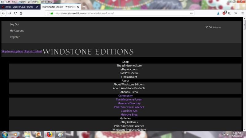
May 15, 2018 at 8:23 pm #1539118I posted this in another thread, but someone suggested that I bring it here because the other thread might not be seen, so: I’m having problems with the website and forum displaying incorrectly!
Starting this afternoon, I’ve been experiencing problems with the windstoneeditions.com website displaying strangely.
All of the header menus have been expanded and centered down the page, like this:

(The screencap is a forum page, but it’s also happening on the main http://www.windstoneeditions.com page.)
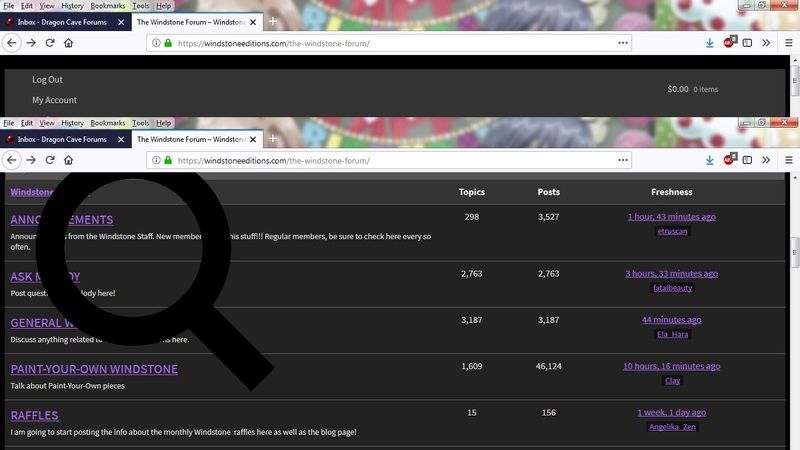
It’s particularly bad on the forum, where things like the search bar have migrated over the actual page and block me from clicking on any of the forum topics:

Thankfully I can click on the ‘newest comment’ links out to the far right of the problem and reach threads that way, or I wouldn’t have been able to post about the issue!
Possibly useful technical notes: I’m using Firefox, newest version. (Or at least, it hasn’t prompted me to update.) This issue started today (5/14) and didn’t seem to be triggered by any browser changes – I’d had the forum open in a tab for over 24 hours and it had been displaying normally; the weird display showed up when I clicked on something in that tab. I’ve tried closing Firefox and reopening, and even shutting down my laptop for a few hours before restarting, but it’s still showing up this way and I’m officially stumped.
Update as of 5/15: it’s still happening and I’ve shut down & restarted the laptop again since I last visited the site. No other pages I’ve visited have displayed this issue, including other forums. Still stumped.
Interested in buying or trading for: GB Pebble Sitting Red Fox in dark grey, Lap Dragon Test Paints (Water Sprite, Glacial Pearl, Opulence, Pastel Rainbow, and many others - see my Classifieds ad), Blue Morpho OW, GB Pebble Loaf dragons in blue/aqua/teal, and Griffin Test Paints (Black Rainbow or Frosted Jade).
May 16, 2018 at 5:54 am #1539123Can we please have a way to opt out of seeing signatures? I’ve seen a few that take up more space on the mobile screen than what the user types in a post.
I will look into this. Not sure if it will be possible. Another fix might be to just limit the length of signatures.
Any luck with this?
…some are a little excessive, and make for a LOT of scrolling. I guess its not the end of the world, but it’s a bit much on mobile device, I do agree with that.
Wanted: "Dragon Fruit" Male Dragon ~ "Fire Berry", "Paradise", "Dragon Fruit", "Tie Dye" ~ The brighter, the better!
May 16, 2018 at 9:20 am #1539129I posted this in another thread, but someone suggested that I bring it here because the other thread might not be seen, so: I’m having problems with the website and forum displaying incorrectly!
Starting this afternoon, I’ve been experiencing problems with the windstoneeditions.com website displaying strangely.
Sorry you’re having this problem. I’m looking into it right now.
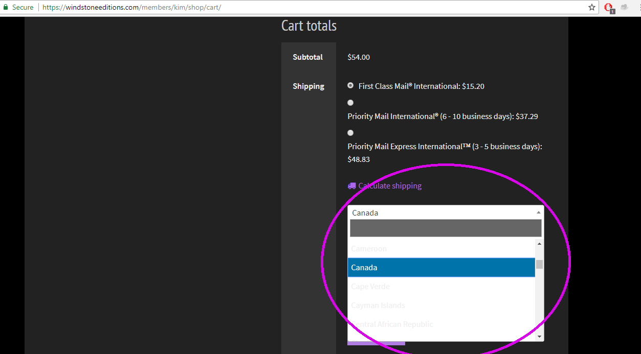
May 17, 2018 at 1:38 am #1539151When I was in the store and added an item to my cart and tried to look up shipping for a different address for someone in the US I couldn’t even see the options for countries and states because the writing is too light until you highlight it. I really had trouble with it so can you make the words darker or black instead of almost white? You can see I circled the problem here where you can barely see the options.

Looking for rainbow or pink & teal grab bags!
May 17, 2018 at 6:06 am #1539154When I was in the store and added an item to my cart and tried to look up shipping for a different address for someone in the US I couldn’t even see the options for countries and states because the writing is too light until you highlight it. I really had trouble with it so can you make the words darker or black instead of almost white? You can see I circled the problem here where you can barely see the options.
I fixed that yesterday, but you may need to clear your browser cache and reload the page to see it properly.
-
AuthorPosts
- You must be logged in to reply to this topic.
