Home › Forums › Windstone Editions › Paint-Your-Own Windstone › Joliesdragons–PYOs: Ocean FooP (page 3)
- This topic has 66 replies, 1 voice, and was last updated 13 years, 1 month ago by Hannah.
-
AuthorPosts
-
July 4, 2012 at 10:15 pm #882892
Thanks, all! Plague really is my favorite PYO I’ve completed yet–though the next small dragon *might* usurp that role! (And Night Wolf, aka “Shiny” is staring at me with a highly offended expression right now. LOL) The rest of Plague’s detail pics are now up in my PYO gallery for those who are interested: http://windstoneeditions.com/image-galleries/paint-your-own-gallery/joliesdragons
Next problem…
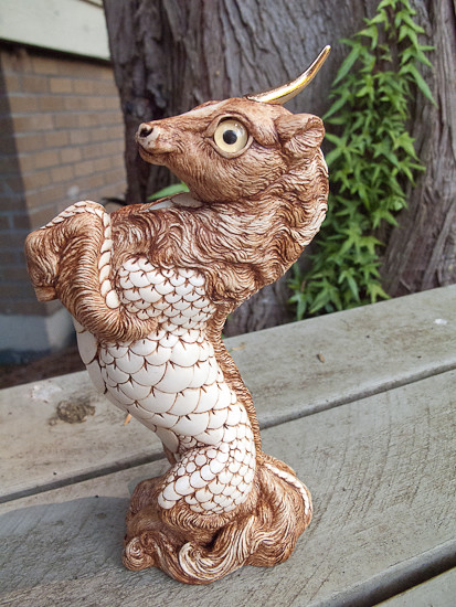
Have you ever done a PYO that came out exactly as you envisioned, and you find you don’t like it? That’s where I’m at right now with the current WIP.
I really love Windstone’s Ivory scheme. I’m really never going to be able to afford it unless they put it in the store (pretty please with squeaks all over it???). But in researching ivory a bit, I started looking at carved ivory netsuke and decided that with the right antiquing, I could make a Ki-Rin (and the Foo Dogs, whenever they arrive) have a similar quality.
This is the example I had in mind (exhibited in the Bolton Museums’ collection):
And this is where we’re at:
(This little one is still in a very raw state, cleanup & touchup needed, no clear coat yet, though that will be matte. Rest of her pics, including closer detail shots, are here: http://flic.kr/s/aHsjAqtPXh)
The good news is, while readying the pics for this post, I realized part of the problem is that the antiquing/glaze I used is just too red (straight burnt umber). (Note to self–if you’re going to base something on a picture, keep the picture in front of you! duh… ) The “ivory” paint I mixed & used is also a good deal whiter than the example’s aged yellowed tones, so I’m concerned that adding a darker brown is going make the contrast too stark.
And I hate the eyes, but I don’t know what color might work better. I’ve tried Tohickon’s metallic green (similar to WS’ ivory moon/sun–which I loved). Nope, doesn’t work with the reddish tones. I suppose if I do darken the brown, it might work better? Tried every color I have on hand. Nope. I really don’t want to go with a dark “horse” brown. Tohickon’s gold is going to be too bright. I’m starting to feel like Goldilocks…
I’m at that stage that most artists hit somewhere along the way, where you absolutely despise the project, but you’re afraid to touch it because anything you might do could make it worse. So I’m putting it here. I badly need a fresh set of eyes on this one.
Artists–If it was yours, what would YOU do next? Doesn’t have to be identical to the example, just in keeping with the theme. What would you change/add/do/redo to give this piece a feel closer to the original?
July 4, 2012 at 11:13 pm #882896I’m not an artist and have never painted a PYO but … would gold hooves help? I think the Windstone Ivory pieces have some gold details.
July 4, 2012 at 11:41 pm #882899Looking at that, the biggest problem I’m finding that the base color is too light for the antiquing you used. The piece to me looks like brown antiqued white instead of aged ivory.
July 4, 2012 at 11:59 pm #882902Maybe playing with grey/browns to give him a dirtier look, so to speak? Looking at your example, there’s no white, just lighter brown-grey, so the gleaming scales look out of place in your scheme. For the eyes, maybe something in the greys too… For the current colors, light brown would do fine. Notwithstanding the fact that he’s not what you want, you have a beautiful natural scheme going!
Read my books! Volume 1 and 2 of A Dragon Medley are available now.
http://www.sarahjestin.com/mybooks.htm
I host the feedback lists, which are maintained by drag0nfeathers.
http://www.sarahjestin.com/feedbacklists.htmJuly 5, 2012 at 12:42 am #882904(Took a break and messed with the iPhone camera for a while instead–different project to clear my head! LOL)
I think everyone’s right at this point. etruscan–I’m definitely thinking gold hooves, and maybe a couple of the tiny round scales in gold too, but that will be close to the last thing I do. The antiquing/glazing definitely needs to be muddied and greyed or darkened. I’ll probably use some as a glaze, but then brush in the darkest areas by hand.
Changing the base–damn. FlamingDragon, I totally agree it should be done; though the piece is a bit more ivory in tone in person, it very much looks like brown antiqued white overall. That said, redoing the scales is going to be a PITA unless I’m missing a trick or two (which I probably am). I guess it doesn’t matter too much in a way that it’s already antiqued, since it sounds like I’ll be doing much of that over again anyway, but ugh–I feel like I’m starting over!
Went out onto Tohickon’s site, since I need to place an order anyway, and found these:

Anyone used them, or opinions? Given the intended scheme, I thought they might make a nice muted tone that blended in rather than contrasted. Then again, once the piece is darkened…
July 5, 2012 at 12:42 am #882905I don’t know what brands of paint you use, but I use a lot of transparent colors for layering. Maybe give him a nice wash of tan/beige to warm up the color palette and knock back the constrast a bit (his “whites” are just a little too white to match the museum pieces). I also agree about changing the eye color; I think light brown would look really nice.
This is turning out to be a really neat piece! 🙂
July 5, 2012 at 1:04 am #882907For changing the base color I would either do a wash like bayou said or dry brushing. That way you keep the antiquing. One thing to look out for with dry brushing is the texture. The keeper I’ve been doing large amounts of dry brushing on has developed a bit of a rough texture. It could be that I’m putting on too thick but it might be a bigger problem on smooth scales. A wash may also help blend the base and antiquing together making it look less like two different colors and more like different shades of the same color.
July 5, 2012 at 1:06 am #882908I agree with bayoudragon: do some layering with thin washes. It will give the piece more depth and emphasize the three-dimensional effect that the netsuke has. The nice thing about using washes is that you can develop the effect to the degree that you like, apply it only where you want it, and you have a fair amount of control over how much color (and which colors) you add. Regarding which colors to use: the netsuke has a fair amount of yellowish olive color on it, in addition to the brown that you’ve already used, so I’d try working that in. I’d also use a combination of that yellowish olive and the brown. Just remember to work with THIN washes, and not a lot of paint on the brush at a time. Develop the intensity of color and the final balance of hues gradually. You might even consider deliberately keeping things a little asymmetric, too, just like the patina on the netsuke.
I love working with washes. Often I don’t even prime the Windstone, just start with my base color in a wash, because the blotchiness and irregular pickup of the color actually works in my favor later on, when I’ve layered on five or six washes and the blotches have become muted. In the finished piece they look like faint shadows, and they always seem to accentuate the curves and shapes of the carving. To my eye, the netsuke has that same kind of serendipity to its patina.
If it’s any consolation, I had a PYO dragon that I gave up on in despair for over a year. He’d been done in browns and yellows, and looked so awful halfway through that I started calling him The Turd With Eyes. I couldn’t stand to look at him. But after a year of painter’s block, I picked him up one day and began working him over in washes. It turned out that his problem was that his coloring was too stark and lacked depth. After many hours of fiddling, he finally arrived at his final color scheme . . . which wasn’t even what I had originally envisioned for him! But he’s one of my favorites.
July 5, 2012 at 2:47 am #882915I knew my paint-fume addled brain was missing something–more transparency to the paint! *smacks forehead* Thank you thank you thank you! I’m laughing at myself– bayou, I just read your awesome muse tutorial yesterday, and here I’m forgetting everything in it.
I’m using Winsor & Newton’s Galeria line (their renamed slightly-better-than-student grade soft body paint in tubes). Some shades are semi transparent, some fully opaque. I can certainly thin them down still further than I currently do for a more transparent wash with various mediums, and the thought of using them over the whole piece to start is less intimidating than the idea of starting over scale by scale. (It’ll be far more effective than anything my mind was spinning out.) Layering more heavily in certain areas after that should put me back on track.
Barrdwing, thanks for the yellowish olive recommendation in addition to the brown tones; that will give me a good starting point. The current brown is a bit more irregular than it may show; darker in some spots, wiped back clear to the ivory base in some high points, then relayered and wiped back much less in other areas to tone down the stark highlights in the mane & tail. I should be able to do similar with the next colors. And I’ll definitely think through the “washes from the start” approach for the small dragon waiting his turn.
FlamingDragon–I know exactly what you mean about dry brushing and texture. In my case, I’m fairly certain I’ve used too much paint in the past. That’s definitely one technique I haven’t really worked enough with to be more than semi-adequate at it. Other than traditional glazed and fired ceramics, these PYOs are my first real work done with paints and the various techniques available. That means more often than not, I really do paint myself into corners as I learn!
Thank you all! At least I now have a better idea of how to move forward next.
July 5, 2012 at 5:19 am #882921Hmm i’ve been thinking about picking up some extra crystals for my dragons. I noted you got some from Etsy…is there a particular seller you used to get that color? I really like the shades.
Very lovely PYOs, that Plague dragon is adorable and I love the color combinations =)
July 5, 2012 at 9:16 pm #882938Jolie!! (I’m sorry I haven’t responded to your PM yet – and this message will be quick – but I’ll respond as soon as I can!!) Your Kirin looks GORGEOUS. I just happen to pop in real quick to look (I didn’t read much in the thread so I am hoping that this helps in some way!) and I saw you mention the Stippled Yellow eyes that Tohickon has – I have used these eyes in a couple of different PYOs – a Keeper, and a small Dragon – Here are some pictures of their eyes 🙂 They are a gorgeous color, and the photo that Tohickon gives them is very accurate 🙂
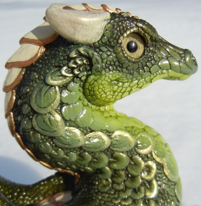
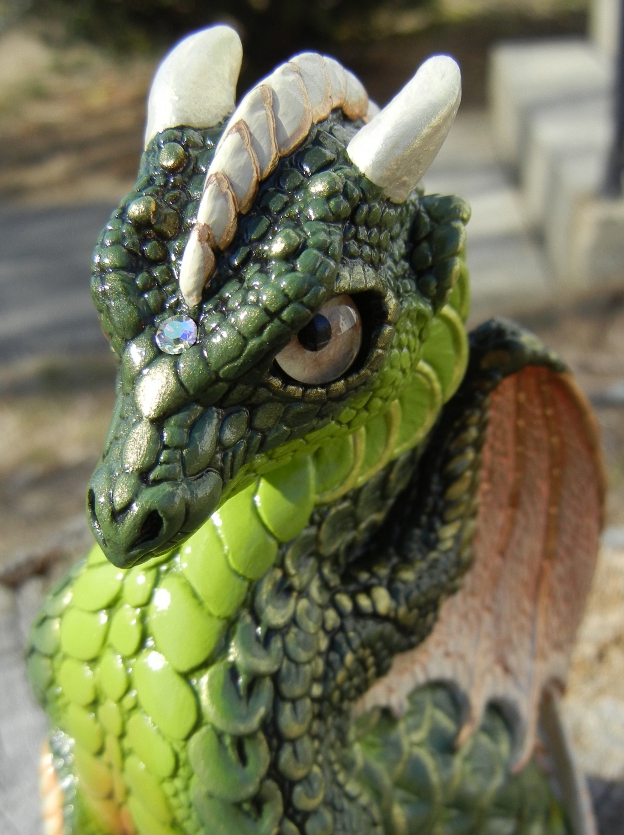
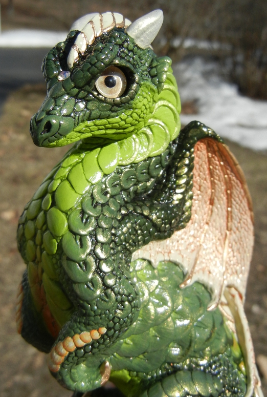
For color reference – the whitest part of those PYOs was a cream color. The Stippled Light Yellow is darker than cream, lighter than yellow, and has tan/brown streaks and spots in them.
Hope this helps some! I cannot wait to see what else you do with your Kirin, shes already stunning!!
Commission spots are currently closed! Please message me for details.
Please visit My Webpage to see my art and PYO's that I've done in the past!July 6, 2012 at 3:55 am #882960No progress today; was down with a migraine all day, so I got absolutely nothing done on anything, including PYOs. Hopefully tomorrow works out better.
Definitely going to pick up some of those stippled eyes…I’m becoming an eye & rhinestone addict. (Though to be fair, more of the rhinestones will end up in jewelry–I pick up old rhinestone brooches all the time in need of repair & convert them to focal points for feather hair fascinators. It’ll be nice to be able to repair them rather than hiding the missing stones in an inconspicuous spot. And I’m back to thinking about earring designs again too. LOL)
Siri–the stone used in Plague’s tail is a Swarovski Rivoli cut chaton (foiled & pointed back); the official color is “Volcano” and the size is 24ss–just over 5mm.
A couple of things to note: Rivolis are no longer made, so they’re all vintage, and the smaller sizes are REALLY hard to find (anything below 10mm, 12mm-14mm is typical). Most colors available in the big ones aren’t available in the 5mm. This is the smallest size Rivoli cut I have managed to find; I don’t think they actually made them any smaller. You don’t want the ones that say “sew on” or “pendant” as these typically have drilled holes in the gems.
Because these stones are actually over 5mm, it took a fair amount of time scraping out the tail hole to fit it correctly (and then repainting the area to mask the edges of the dug out spot). You want it buried as close to the beveled edge as possible, because the color/foil process they used on these turned out to be really fragile, more so even than a regular gem. Leaving any of the foil exposed means the edges will likely chip, and the color will vanish when the foil does. Also, as it’s a shallow cut, I actually found it harder to set in that spot than a traditionally cut rhinestone. It was worth it, because even the tiny rivolis are amazing–but it was definitely a good bit of work to get it set level.
I purchased the Volcanos from BeautifulJewelry on etsy. Mine are not loose stones; rather, they’re set in pronged brass settings with a single loop that I plan to use in jewelry, so I have to pull them out of those settings if I want to use them for PYOs. That’s a huge nuisance on such tiny stones…but it was cheaper because I could buy fewer stones than if I bought them loose, and I’ve been spending way too much on stuff lately. Having said that, I’ve actually thought perhaps I should get together every color I can get my hands on and divy them out into small assortments of the colors if people here really like them…the tiny rivolis are THAT hard to find, and no one sells mixed lots.
Do be careful not to buy ones mounted to fancy findings if you want to use them for PYOs. Some of the sew on ones are set in prong mounts, but they’re a lot more expensive. As for the others…if there are no visible prongs, the stone is glued in place. Once they’re glued, you can’t remove them without destroying the foil and losing both color and sparkle.
Also, one general note on rhinestones that I probably should add to the gem & eye thread: if it doesn’t specify Swarovski in the listing, seriously consider passing it by. I spent money on an ebay lot that specified “fire polished” and “machine cut” rhinestones in addition to Swarovski–well, it was about 1% good stuff. The fire polished stones are simply glass and have little to no sparkle to them, and the non-Swarovski machine cut gems weren’t consistent in color, size, or shape. They also weren’t as sparkly, though they were better than the fire polished glass. Spend the extra to get the real thing. It’s worth it–otherwise, you’ll just end up frustrated and buying actual crystal gems later! I have some all Swarovski mixed lots arriving tomorrow that should prove to be more useful both for jewelry and PYOs. No rivolis in the batch though, unfortunately!
July 6, 2012 at 4:34 am #882962THank you very much, I appreciate the information and I’ll definitely keep what you said in mind when I start looking =)
February 16, 2013 at 4:41 am #893319Well.
The Netsuke Kirin never has been finished; it’s been sitting as-is in the curio cabinet. I’ll get around to finishing it eventually.
Meanwhile, I have two other projects that are in process. One is a Keeper inspired by the Maleficent dragon in Sleeping Beauty–she’s metallic black with interference purple and an almost neon looking interference in green-gold. Pics on that one when it’s a little further along. 🙂
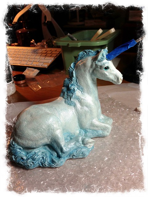
But because that project has some finicky detail work, I’m having to work on it only a little at a time. The new eyes for my PYO Unicorn came in yesterday (thanks, Susie!), and almost immediately, I knew what I wanted to do with this one. I’d been reading posts here and there from Jennifer about using transparent glazes to layer on a more natural looking color with lots of depth. Since I always feel like I’m losing too much of the detail in the sculpt (even when I rationally know I’m not!), I figured this would be the perfect technique for a unicorn.
Meet Frost:
Ice/snow/winter paint schemes are nothing new around here, obviously, but I figured this was the only likely way I was going to get my hands on a uni this color. LOL Given the natural pewter horn, I’m thinking I’ll do silver hooves & mane/tail “beads”, plus either light blue topaz AB or clear AB crystals…though the gems might change depending on what I already have on hand.
The transparent glaze method is super easy so far; I’ve never had a PYO go so quickly. Of course, what I think of her in full daylight might be another story! I’m using Liquitex Iridescent/Pearlescent medium as the base of my glaze, which gives her a nice pearly glow.
Hopefully I can get her done this weekend…and hopefully Maleficent cooperates too! 😉
February 16, 2013 at 9:17 am #893328Looking really pretty so far, I love that colour of eyes with her coat, it really compliments nicely! 😀
Check out my finished artwork at http://falcolf.deviantart.com/ and my sketch/studio blog at http://rosannapbrost.tumblr.com/
Excellent!
-
AuthorPosts
- You must be logged in to reply to this topic.

