Home › Forums › Miscellany › General Art Discussion › Monogram ideas for ruffian, dragoness and NIRVANA
- This topic has 84 replies, 1 voice, and was last updated 18 years, 6 months ago by Maria.
-
AuthorPosts
-
January 12, 2007 at 8:24 pm #520192
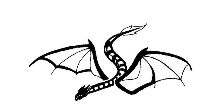
I do like them. Now, I can’t make up my mind. hehe. I will have to get some more opinions. One thing, if you kept the first design…but added a wing on the left side..and make it look like it is in mid air about to strike..maybe that would look good. I am not making any sense, am I?
January 12, 2007 at 8:31 pm #520193Yeah, I think you are. 😛 The top design does have a wing, but it doesn’t show up much so I further developed it in the second design. I’ll have to think about the best way to make it look like it’s ready to strike – do you mean the way a snake strikes, head up, neck arched, that kind of thing? Or do you want some back legs on the dragon? Give me pointers, and I’ll work them in… 🙂
January 13, 2007 at 3:46 am #520194Well, I asked ppl what they thought. My bf said he liked the bottom one the best and then the middle one came in second. My friend said that she liked the first one and the bottom one. So ack. Now I totally don’t know what to do unless you finish the top one and then the bottom one, but I don’t want you to waste your time either. Well a dragon would have legs, so I guess draw them in. And I guess a snake striking would be accurate.
January 13, 2007 at 5:02 am #520195All right, I’ll see how far I get in modifying Design 1 today at school. It’s a monogram, so I think you do want to be able to see the letters’ approximate shapes, but I’ll see how a pair of back legs fits in.
January 13, 2007 at 5:35 am #520196Yes, I would like to see the letters. Thank you.
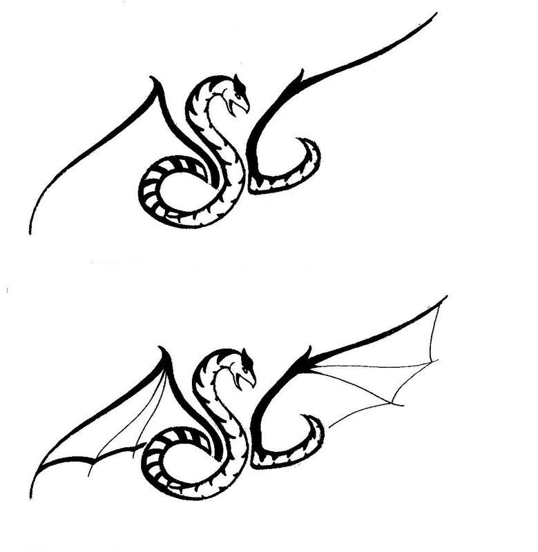
January 14, 2007 at 7:59 am #520197Here is Design 3, which was way easier than Design 1:

Anything you would like changed?
Now for Design 3 I made three version: One simply made of the letters, one with wing veins

and the third with some legs sketched in. The first pair of legs look like a can-can dancer’s. 😕 If you like the second pair of legs I’ll put them in in better detail.
 January 14, 2007 at 9:18 pm #520198
Ok, I think I like them with out legs (Sorry, guess I had to see what it looked like). I like Design 3 and Design 1 with the wing veins. Thanks a lot. 😀
January 15, 2007 at 4:31 am #520199Cool, I’m glad you like them. 😀 Would you like Design 1 with wing veins reposted by itself, e-mailed, whatever, or can you use the designs like this?
January 18, 2007 at 5:27 am #520200I could probably use them like this. If it doesn’t work then I will let you know. Thanks.
January 18, 2007 at 5:29 am #520201Great. I’m PMing you about the Gargoyle LogoStone.
February 9, 2007 at 8:01 pm #520202Another bump:
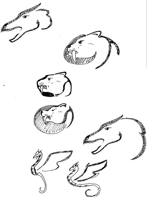
I apologize for the awful proportions on the cats, Nirvana. These were done during math, no reference material available, unfortunately. A couple ideas for you and Louis. Be honest – if you don’t like them, there’s no end of other ideas. 😀
 February 11, 2007 at 5:33 am #520203
Those are cool. I like the dragon heads and the first cat.
February 11, 2007 at 5:39 am #520204Glad you like them, dragoness. I’m no good at drawing cats without reference. I don’t practice on them much. 😕
February 11, 2007 at 5:47 am #520205Well, I think that is why I like the first one. It looks like a cat more to me. The second one reminds me of a panther or something like that, the 3rd one looks like a bear to me. But they are a lot better than what I could draw. 😀
February 11, 2007 at 6:13 am #520206The difference between the cats – this is for Nirvana’s info, too – is minimal, but makes a difference. On the first one the T is different from the other two. The second has a fat line that follows the face to make the C, instead of having a “full moon” type thing like the other two heads. The T also makes the jowl, instead of the neck like on the first one. The third one combines the full moon and the jowl-T. Of course, whichever design Nirvana chooses – if she likes any – will end up actually looking like a cat when I’m done. 😀
-
AuthorPosts
- You must be logged in to reply to this topic.
