Home › Forums › Windstone Editions › Paint-Your-Own Windstone › Siberakh1's PYOs – 4 new pieces added 7/26 pg 5!
- This topic has 237 replies, 1 voice, and was last updated 11 years, 9 months ago by Amanda.
-
AuthorPosts
-
September 29, 2009 at 1:38 am #636931
** Dark Wolf wip **
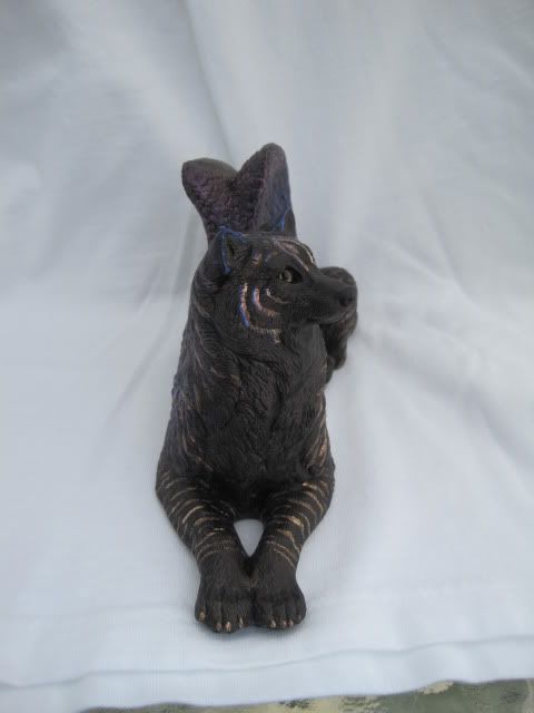
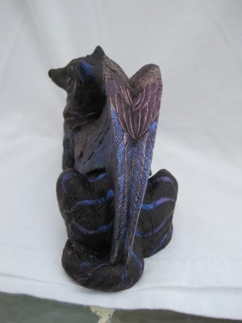
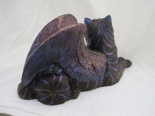
Ok, so here is the latest one I’ve been working on. No, he is not done (sort of). I uncovered his eyeballs, just to give a better idea of what he would look like, but I’m rather unhappy with how he turned out. I like the wings (not as sure about the backs of them, but in generally I’m not unhappy with them). I do like the striping on his forelegs. The rest of him though didn’t really work out like I wanted. He was an idea of me seeing a mod done on the back of a BJD (ball-joint doll – an Iplehouse Limited Kamau from their Nocturna Circus line for those interested) and trying to make it work on a pyo wolf. I saw a picture of a black BJD that the owner had the idea of making him a were-tiger warrior swordsman. The only mod she did to him was she gave him golden eyes and added orange/gold intereference stripes to his back which looked amazing against the dark backdrop of his back. I tried to do the same thing on the body. The orange interference didn’t cooperate like I thought it might. I tried thinning it with water, light coats, even clear medium, but it looks milky in spots to me (my mom doesn’t think so). In talking with a couple of others, I tried to bring in other colors into the stripes and have it go from one color to another, in this case, blue to purple to red to orange. Again, I don’t see where the orange cooperated well. I would have really had to start with the color I wanted on top first (which I wasn’t sure of at the time). I didn’t try to make the stripes on his body realistic. The areas of orange I used powders mixed with a gloss medium came out the best, but the interference just didn’t do it. It did give me a chance to play with interference colors on black though and see how they would react (hadn’t really worked with orange much on black before). Some of the problem may be the base. It’s not black. It’s a charcoal brown-black and was airbrushed on over a wash of black (which looks really cool). I think the coat being thin in some areas didn’t take the orange interference well. Regardless, my mom likes him, but my dad and I agree about the wings and front stripes, but think the rest of him is GAUDY! He isn’t sealed, so I have a mind to paint over the body, leaving the wings of course, and do something in blue interference, either just blue/purple stripes, or spirals for fun. Thoughts?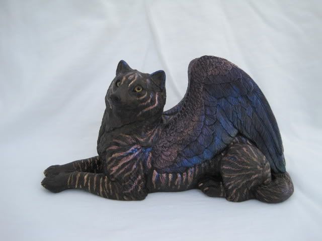

 September 29, 2009 at 4:50 am #636932
I’m not sure how I would change it :scratch: . I love the markings on the body and the wings are lovely. Personally, I love gaudy, so I’d say he’s fine the way he is 😀 .
September 29, 2009 at 6:42 am #636933I think the issue my brain is having with him is that there are SO many stripes everywhere else, and absolutely none on his chest. While I’m not saying fill his chest with stripes, maybe “extend” a couple onto his blank ches area to kind of pull it back in with the rest of the piece. Just a thought. Other than that, I don’t think he looks bad at all, I really like him. Although I will step asside for the “artists distaste” that happens with all artists when they don’t like something about their piece of art. Heck even Miss Melody goes through it 😉 Did you know she almost chucked the idea of the Curlies? She had a real distaste for them and was almost not going to put the first batch of russets up on eBay because of it. Let’s just say she was convinced otherwise and now look where they’re at! =P
September 29, 2009 at 5:14 pm #636934Nirvanacat13 wrote:I think the issue my brain is having with him is that there are SO many stripes everywhere else, and absolutely none on his chest. While I’m not saying fill his chest with stripes, maybe “extend” a couple onto his blank ches area to kind of pull it back in with the rest of the piece. Just a thought. Other than that, I don’t think he looks bad at all, I really like him. Although I will step asside for the “artists distaste” that happens with all artists when they don’t like something about their piece of art. Heck even Miss Melody goes through it 😉 Did you know she almost chucked the idea of the Curlies? She had a real distaste for them and was almost not going to put the first batch of russets up on eBay because of it. Let’s just say she was convinced otherwise and now look where they’re at! =P
Yeah, this is totally a different style on the body than I normally would ever do (I lean towards more natural ideas and designs, even if the colors are not natural) and it did give me the opportunity to play with interference more than I have to see what it can/can’t do. Hmmm… I could always add some markings to the chest (was originally thinking none, but then again, I was only going to have single stripes, like on a tiger, but not exactly realistic like a tiger, but the orange interference just didn’t cooperate). I’m considering. If nothing else, I can always redo the body on this one, and try executing the idea I originally had on another pyo wolf, just with a bit more knowledge of how to approach it more effectively for better results. I was originally going to do another wolf like my amber one with this pyo, but with lavendar-blues instead of the russet colros, kind of like clouds in an evening sky. :shrug: 🙂
That’s interesting about the Curlies. I’m glad she kept them. 🙂
September 29, 2009 at 9:27 pm #636935siberakh1 wrote:** Dark Wolf wip **
The stripes on the face are sparse, so I find they fit just great. Maybe if you reduced the number of stripes on the rest of the body, it would work better. The wings are just drop dead gorgeous, but they’re ‘simple’ compared with the stripes and I think that’s what’s offsetting the balance.
Loving those colors!
Read my books! Volume 1 and 2 of A Dragon Medley are available now.
http://www.sarahjestin.com/mybooks.htm
I host the feedback lists, which are maintained by drag0nfeathers.
http://www.sarahjestin.com/feedbacklists.htmSeptember 29, 2009 at 10:28 pm #636936The wings are really gorgeous! 8)
September 30, 2009 at 3:01 am #636937dragonmedley wrote:The stripes on the face are sparse, so I find they fit just great. Maybe if you reduced the number of stripes on the rest of the body, it would work better. The wings are just drop dead gorgeous, but they’re ‘simple’ compared with the stripes and I think that’s what’s offsetting the balance.
Loving those colors!
Hmmm.. that’s a good point and both you and Nirvanacat have mentioned it. When you put it that way, that might be what bugs me so much (other than the interference problems I was having) so many stripes vs. the wings. I think I may try and redo the stripes entirely on the main body and back of the head tomorrow and make them a bit more sparse. I’ll post an update tomorrow (I think I have enough time to do that tomorrow before work if I get up early and don’t sleep in tomorrow. The bonus of working nights – you get to sleep in the next morning without having to worry about when to get up. :wink:).
Will update tomorrow. :bye:
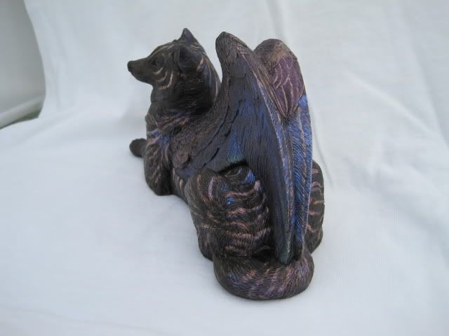
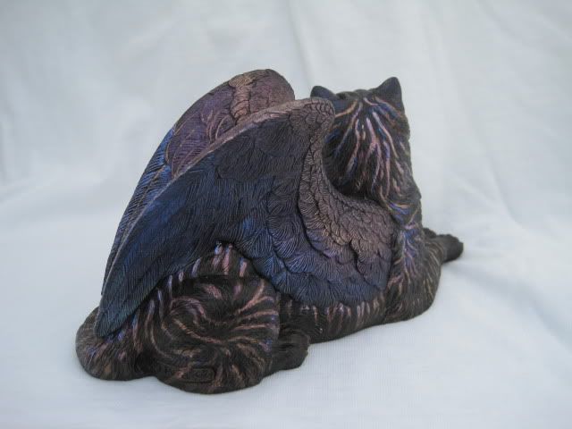
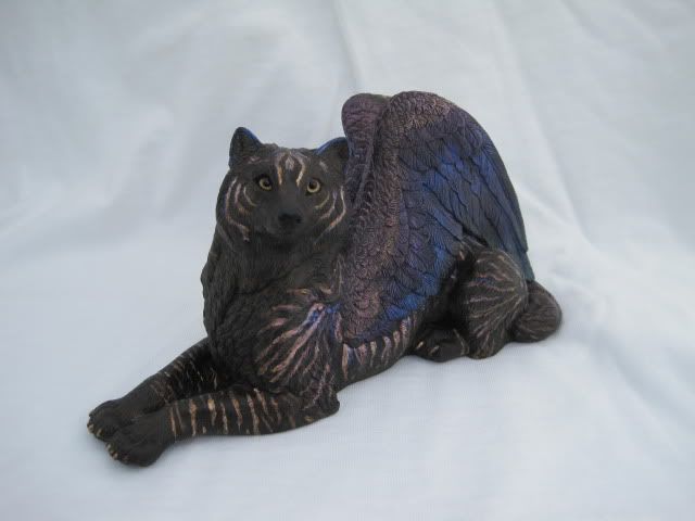
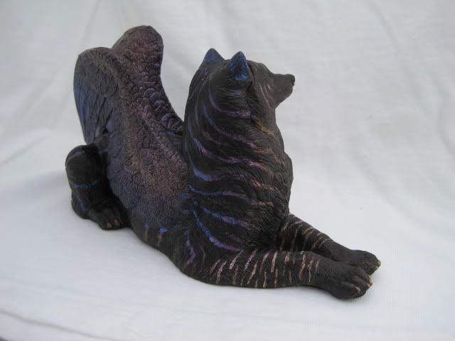
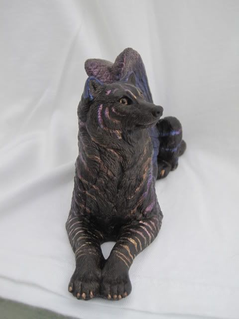
September 30, 2009 at 6:43 pm #636938Ok, so I reworked the main part of the body. Made the stripes fewer and cleaner and managed to do a progression with the stripes like I originally intended, though with a bit more blue and purple than just orange to match the wings (now that I’m a bit more aware of some of the issues I had in applying the orange before). I also brought the purple into the foreleg stripes a bit for a better color transition. I’m not sure if I should lessen the stripes on the forelegs just a tad (ie. just lose a few of them to give more spacing to them), but otherwise, I think I’m happier with the stripes as a whole now moreso than what I started with originally.
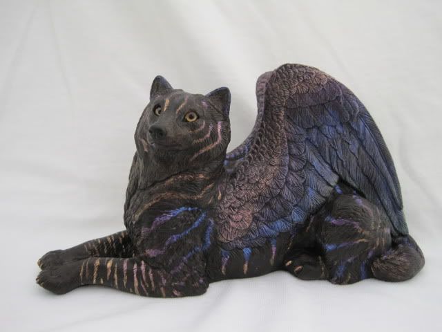
 September 30, 2009 at 6:55 pm #636939
Naw leave the front leg stripes, I like them =P He looks quite a bit more cohesive now with the extended stripes. Before it just looked like “Oh hai someone just glued some fur onto my chest to cover up my nekkedness” Now it looks like he was born with it =P Very nice!
September 30, 2009 at 9:20 pm #636940I love it! It works great.
Read my books! Volume 1 and 2 of A Dragon Medley are available now.
http://www.sarahjestin.com/mybooks.htm
I host the feedback lists, which are maintained by drag0nfeathers.
http://www.sarahjestin.com/feedbacklists.htmOctober 1, 2009 at 12:51 am #636941dragonmedley wrote:I love it! It works great.
I agree! He looks lovely now! Not that he was *bad* before, but now he’s just much more striking!
Interested in buying or trading for: GB Pebble Sitting Red Fox in dark grey, Lap Dragon Test Paints (Water Sprite, Glacial Pearl, Opulence, Pastel Rainbow, and many others - see my Classifieds ad), Blue Morpho OW, GB Pebble Loaf dragons in blue/aqua/teal, and Griffin Test Paints (Black Rainbow or Frosted Jade).
October 1, 2009 at 2:33 am #636942Woo he looks even better now (I liked him before)!
October 1, 2009 at 6:04 am #636943Ooh, nice! I think the rework is an improvement.
October 1, 2009 at 6:20 am #636944I love how you reworked him, fantastic job
October 1, 2009 at 5:13 pm #636945Thanks everyone for the critiques and kind words (and special thanks to Koishii for the ideas and thoughts over PM when I was really ready to chuck this guy across a room into a wall 😀 ). I’m going to seal him up today before work. I think I’m going to call him ‘blue flame tiger stripe’. He’ll be going up in the marketplace tomorrow.
-
AuthorPosts
- You must be logged in to reply to this topic.
