Home › Forums › Miscellany › General Art Discussion › Identity Design – Easy to do for others… (added to)
- This topic has 20 replies, 1 voice, and was last updated 16 years, 5 months ago by Rusti.
-
AuthorPosts
-
August 21, 2008 at 2:08 am #728964
…difficult as all get-out to do for yourself.
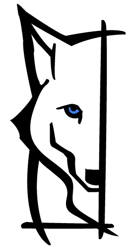
So this is my current mark:

It was done for a class and in a rush and I don’t feel that it’s as put-together and slick as it could be. It looks like I didn’t spend much time on it, and I didn’t.
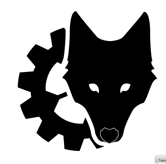
So I’ve been working on something new for myself and the first to come out of it is this mark:
 And reversed:

I haven’t yet had time to add text in to fully complete it, but I’d like some thoughts from you guys. I’m hesitant to take it to the LJ graphic design community because I don’t always agree with the critiques they offer to others that post there.
So tell me what you think. It’s always hard for me to design for myself because I’m never satisfied.
August 21, 2008 at 2:08 am #496457August 21, 2008 at 5:17 am #728965I like the middle one alot, but the bottom one would go better on white paper 😛
August 21, 2008 at 6:55 am #728966When I look at your website name, Steel-Wolf, the first thing that comes to mind is a wolf of steel. Maybe a wolf’s head with a metallic sheen and sharp contours would be fitting? Or is that too obvious?
August 21, 2008 at 1:55 pm #728967Greater Basilisk wrote:When I look at your website name, Steel-Wolf, the first thing that comes to mind is a wolf of steel. Maybe a wolf’s head with a metallic sheen and sharp contours would be fitting? Or is that too obvious?
I could sharpen the corners on the gear-wolf a little bit more, yep, but I’m looking for a way to nod to ‘steel’ that isn’t a gradient (and that would no doubt be how a ‘metallic sheen’ was added) and is a little more creative. I’m looking for a solution slightly less obvious, if you know what I mean?
I do like the suggestion, and I’ve tried it a couple different ways but just wasn’t crazy about the way it looked.
Dragon87 wrote:I like the middle one alot, but the bottom one would go better on white paper 😛
😉 I reverse everything out to make sure it would work both on a website with a black background, and on a business card/piece of paper with a white background. And it also helps me pick out what is or isn’t working.
August 21, 2008 at 6:15 pm #728968I like the bottom image more, too. Where were you thinking of putting the text and what will it say? Maybe the text itself could bring out the sharpness of steel if you use the right font?
August 21, 2008 at 7:50 pm #728969purpledragonclaw wrote:I like the bottom image more, too. Where were you thinking of putting the text and what will it say? Maybe the text itself could bring out the sharpness of steel if you use the right font?
I think this evening when I get home I’m going to work on incorporating text. A hard edged font would probably be a good idea, thanks! I have to admit a soft spot for Futura, but I got a ton of new ones when I bought CS3, so I’ll go through what new I got.
I’ll get some thoughts together and show those when I’ve done them.
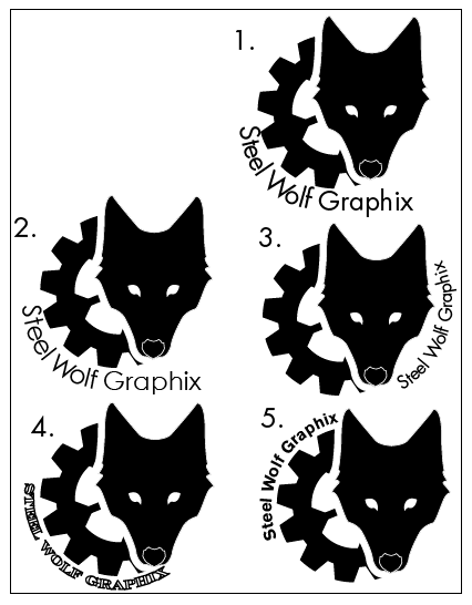
August 23, 2008 at 1:50 am #728970Here is a sheet with a few variations with text added.
Tell me which one you favor and why?
 August 23, 2008 at 2:20 am #728971
#3, ties the wolf in best. #5 comes in second.
#1-spacing is too odd
#2-a bit bland (for me)
#4-type is too hard to readAugust 23, 2008 at 3:42 am #7289725 is my favorite. 3 is my second favorite.
I didn’t like 1 and 2 because of the flow of the text. The font was too hard to read on 4.
August 23, 2008 at 3:26 pm #728973I also find #4 hard to read.
1 and 2 are very similar, but I think the bold face on #1 comes out better.
#5 looks a bit lopsided, so it’s between 1 and 3 for me. 3 because the “wheel” is complete, 1 because the “wheel” is still rolling, so to speak.
And I still like your original one 😉
Read my books! Volume 1 and 2 of A Dragon Medley are available now.
http://www.sarahjestin.com/mybooks.htm
I host the feedback lists, which are maintained by drag0nfeathers.
http://www.sarahjestin.com/feedbacklists.htmAugust 23, 2008 at 6:11 pm #728974I prefer 5 and 3 but I think I prefer 3.
5 puts too much weight on the wheel – it’s visually ‘thick’ looking with the text there.
1 and 2 are similar I have the same problem with both – to me where the text goes from curved to flat, it almost looks like the words curve down. An optical illusion, for sure, but it looks weird to me. However 1 looks better then 2 with the bolder font.
I have the same problem with 4 as everyone else, I can’t read it.
August 23, 2008 at 11:06 pm #728975I like #3 the best, it balances.
Kyrin
August 25, 2008 at 2:58 am #728976#5 is my favorite.
The text is clear. The way it wraps around the gear flows nicely. While #3 is my second favorite, I think having the text flow around the gear is more appealing flow wise. The wolf on the side adds interest. I don’t think the placement of the text on #3 is as balanced as it could be because it doesn’t form a perfect circle with the gear on the other side. It’s off by a bit in alignment, which comes across as slightly disjointed in my perspective.
I like the font in # 2, then #5. Clean, crisp, no frills and straight to the point.
August 25, 2008 at 6:07 am #728977I vote for Variant 5. I think having the text left of the wolf, as in variant 3, adds a sort of appendix to the design and disturbs the clear-cut right edge.
-
AuthorPosts
- You must be logged in to reply to this topic.
