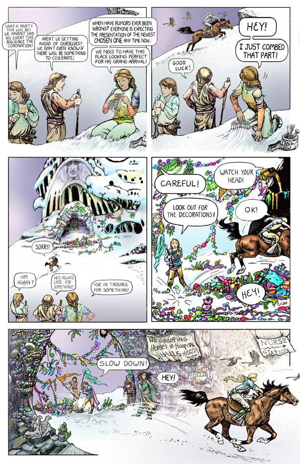
Now in color!
I still hate this page. Too cluttered. Oh well, if you try to make everything perfect, you never get anything finished.
Page 5, Page 7 and the next few pages were drawn in a large format. The original art page is 11 x18, so the words and details are a little harder to read at this resolution than later pages will be. This is a traditional size for printed comic pages , but I decided that making pages large like this is stupid for a comic that need to display as a webcomic.
Now I draw them 8×12 inches.
I can manage to read the words on my computer monitors, but let me know if you can’t make them out on yours.
These pages are hybrids of real media and digital.


Read it fine . Getting so good . I enjoy reading it .
No problems here either. Keep it coming Melody. 🙂
No galloping horses in hospital halls XD LOL!
This is already getting really awesome 😀 can’t wait for more!
This is why I still get paper copy of comic books – iPad screen is too small for comics, and the computer screen just doesn’t cut it. All other books, I get digital copies, though. Should you decide to make this available to buy, I would go for the traditional print copy.
This is GREAT so far! Your talent is absolutely amazing. Only problem is I am finding a greater urge to own a furbird!
I plan to make this book as a print copy when it is done.
I read the first pic out of order cuz of the way they are set up… read the first one, then half the second, then the third, then the second half of the 2nd… My eyes just drew to the 3rd bubble before I finished.
Loving the meercats and the humor.
I hate that first panel, but sometimes you just gotta stick a bunch of words in, to explain things. It is pretty crowded.
Yeah I see what you mean. I could change the order of the left hand side bubbles so the question comes first, then the answer, but I think the top left bubble sets up what is going on, so it is needed first. erg.