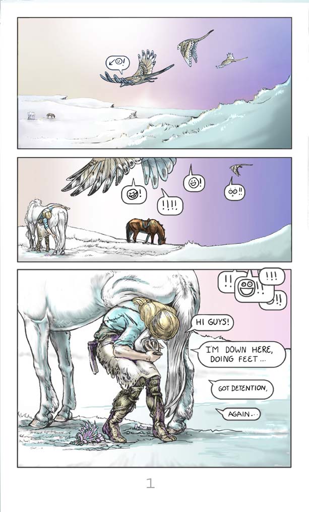
Page 1 in color! I have been going over the pages that were in black and white and adding color. Not too garish, or distracting from the pen and ink work…so far
The Veligent – Page 01


Page 1 in color! I have been going over the pages that were in black and white and adding color. Not too garish, or distracting from the pen and ink work…so far
You must be logged in to post a comment.
OKay, I love how you have the emoticons for the birds. I can just hear the cries in my head, but the birds don’t “talk” per se. It’s a nice touch.
EDIT: Or are those winged meerkats? Okay, that’s fantastic!
How on earth did you figure out those were winged meerkats??
Well, the tails weren’t birds’ tails, you’ve drawn winged meerkats before, and…
…I looked at page 2. *sheepish grin*
I’m not sure how I feel about the emoticons. I think they would be more aesthetically pleasing if they were typed, or had a more “formal” look. The hand written look of them is in bad contrast to the more serious, and beautiful artwork surrounding them. Its hard to take the whole page seriously with “:D” and it also creates friction-in my mind at least. Also, the speech bubbles in this scene…the human’s speech, since it is all one thought from one person, they should be connected somehow, or in one big speech bubble. Other than that, the artwork is amazing and the scenes flow together nicely!
Yeah, I guess the art on these first few page does look “serious”. The emoticons will fit better when you see the next few pages. The art morphs into goofier styles,and back again, depending on the situation.
I wanted to use hand lettering rather than a commercial type (gives it a more home-made, amateurish feel), so I felt the hand drawn emoticons were a better fit.
After spending half of my time just lettering though, I got a program that lets me type my own hand-drawn letters, so you’ll notice a slight change in the style a few pages on.
This is an interesting observation. It is very hard for me to know how this comic will “read” to other people! Thank you so much for the comment!
That uni has a great butt.